Website Analysis
Colony House is the band that sings the song I am using and will therefore have a website conventional of the indie rock genre.
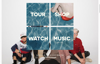
The home page of their website is very simplistic so that the tabs and band name are clear and coherent. They immediately have their new album “The Cannonballers” plugged in the middle of the page, with a long shot of the band during a photoshoot from the filming of their new music video. Their casual clothing and stances make them look down to earth and relatable which I will like to reflect in my own website. I think I will use a candid shot from the filming of the video for this, and have some sort of link straight to the video, allowing immediate access for the audience. They have each tab plugged in a bold, sans serif, all caps font to really push the audience to interacting with their website.
At the bottom of this first home page it says “Catch us on tour in a city near you”, promoting themselves as live artists and using commercial imperative to emphasise this. They also have this checkered flag motif that is consistent all across their website that links to their new album.
Their tour dates are listed immediately with links to TICKETS and RSVP, making it quick and easy for the audience to see the band.
Straight below this is a page for the band’s merchandise with T-shirts, caps, tote bags and may variations of their new album on vinyl. They have a few special edition vinyls that I think will be useful to have in order to promote a cult fandom and avid fans.
In addition to their merch, they have a brand of wine, which is unconventional of most bands. I think this will be inappropriate to do for my audience as it consists of under 18s. I think it would be worth coming up with some sort of niche brand to feature in the video that will be relevant to my demographic, and provide some cross platform convergence.
One of the tabs links to a page called “EXIST FOR GOOD” which is a collaboration with a charity that tackles child hunger. It would be effective linking to a brand that does charity work especially as one of the Beggars Group labels has done the same.
They also have a BIO section that has a slideshow of band photos and a long description of who the band are and what they stand for. This allows the audience to connect with their favourite artists and feel some closeness to them


No comments:
Post a Comment